
Modern brands redesigned as if they were from the USSR
From Russia with Brands. Russian logo designer Mike Levchenko redesigned famous brands as if they came from the Soviet Union.
Photo credit: Mike Levchenko
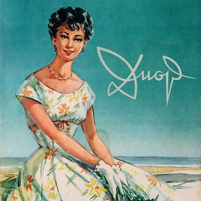
Here is how Dior would probably look like if it came from the Soviet Union :P
Hi, I stumbled upon this funny project by Russian letterer and logo designer Mike Levchenko transforming some modern logos as if they came from the Soviet era, and I think he really did a convincing job. In the following examples you can see the actual logo, Mike's cyrillified version and a retrotized poster below.
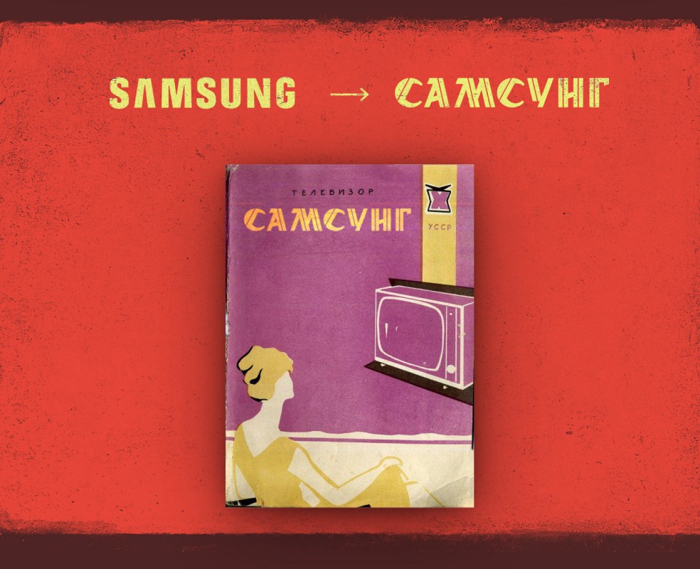
Samsung → Самсунг

McDonald's → Макдоналдс

Mercedes-Benz → Мерседес
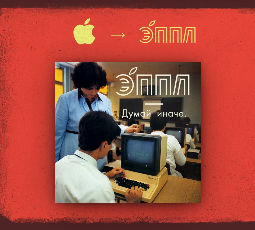
Apple. Think different. → Еппл. Думай иначе.
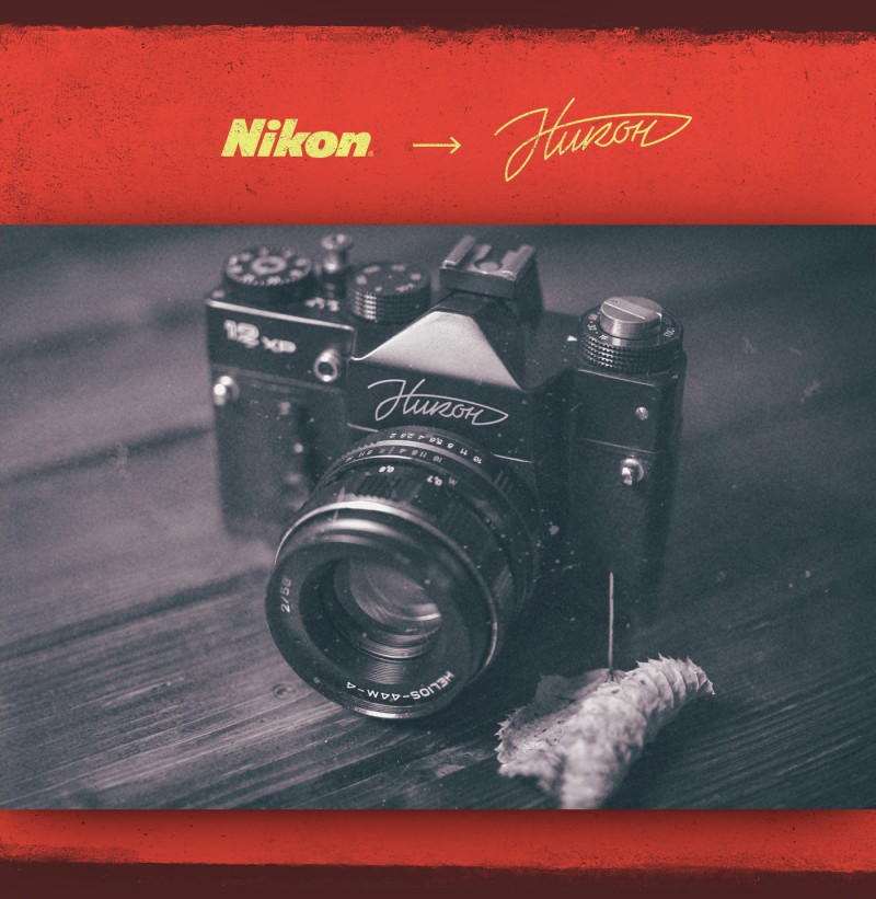
Nikon → Никон
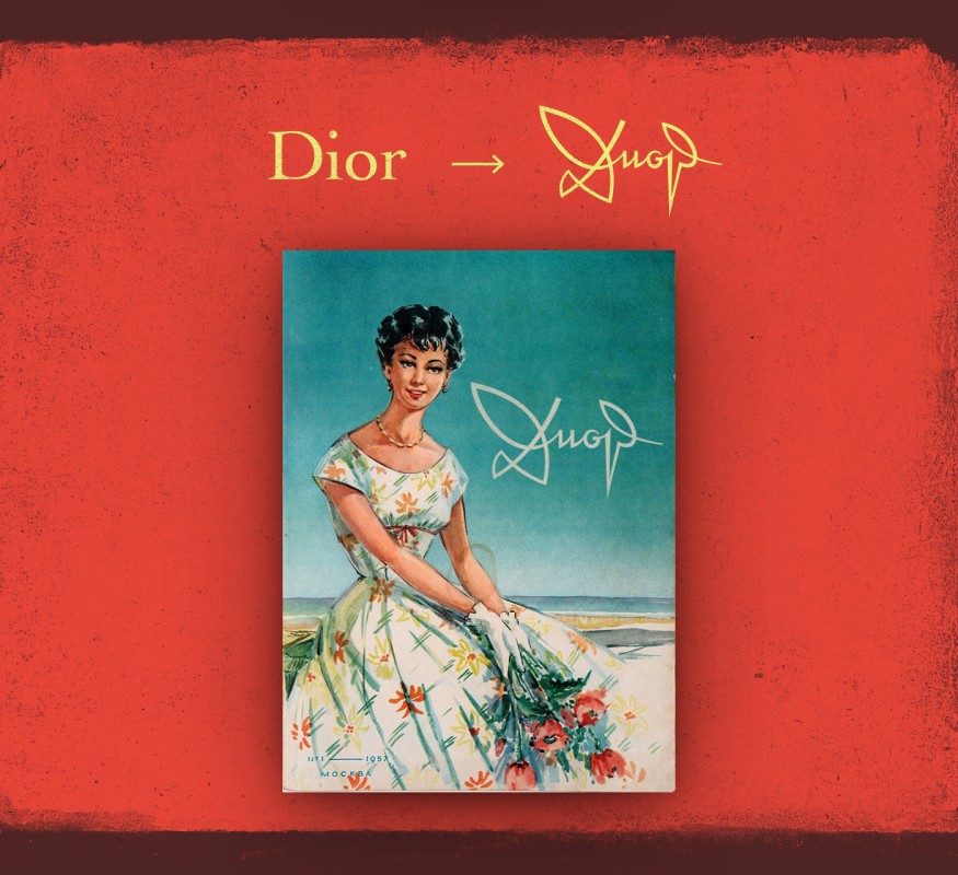
Dior → Диор
Which sovietized logo do you like best?
Related stories
The Secret Meaning Of Brands
The New Beauty Secret: Fotoshop by Adobé
Soviet Matryoshka Dolls
Add ❤ comment:
Share your love, thoughts and secrets, leave a comment:
